Freelance Work
UI / UX of Mobile App - Azad Mandi
Azad Mandi also known as Azadpur Mandi is the Asia's largest wholesale market for fruits and vegetables. Every day thousands of trucks bring fresh produce to it from all over the country, and the annual arrivals amount to millions of tonnes.
My Role
- Journey Mapping
- Wireframing
- Screen Flows
- UI Design
Platforms
- Mobile Application
- Android
- iOS
Year
- Feb 2021
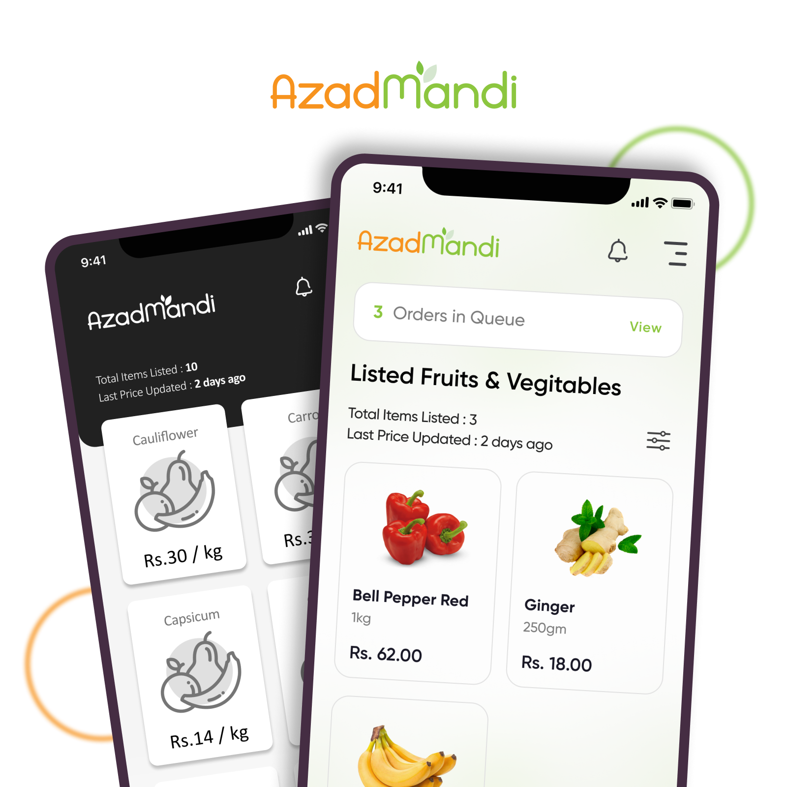
I was asked to create a new approach for buying/selling Fruits and Vegetables at Azadpur Mandi through a Mobile App.
Building Digitalized Platform for F2B to B2B to B2C.
RESEARCH
WHAT DOES THE OLD LANDSCAPE LOOK LIKE?
The Problem
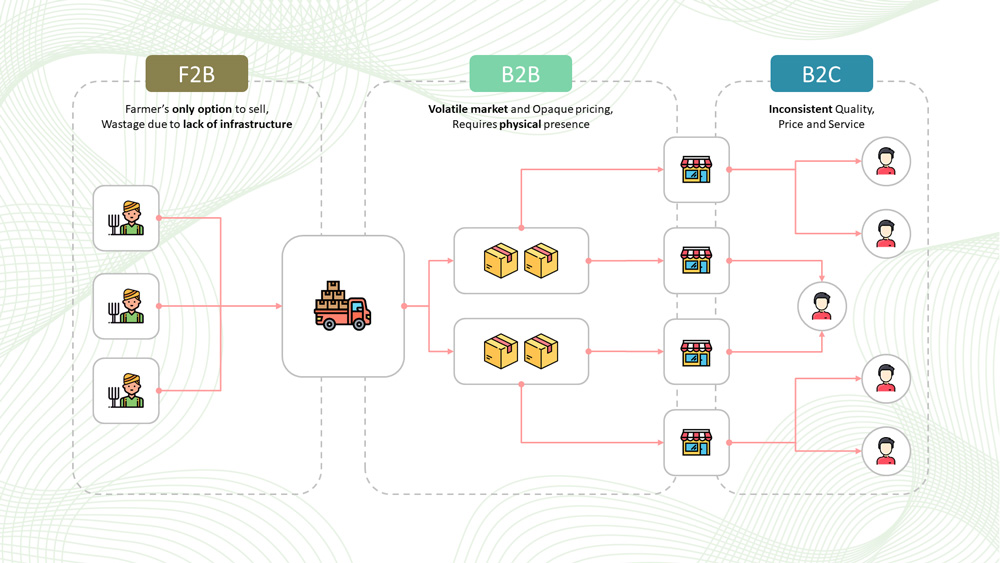
Farmers Side (F2B)
Over half of the farmers we interacted with (57%) are unhappy with the mandi system of sale.
Sales Process
The sales process in mandis is regulated through commission agents (CAs) who mediate between the farmers and traders.
Pricing
Lower price realisation, lack of transparency in the trading process, collusion among traders, price cartelisation & delay in payments
Dependency
Most farmers depend on CAs for credit, price information, transportation and storage.
Traders to Shopkeepers (B2B)
Volatile market and Opaque pricing, Requires physical Presence.
Shopkeepers to Customers (B2C)
Inconsistent Quality, Price and Service.
The Solution
WHAT DOES THE NEW LANDSCAPE LOOK LIKE?
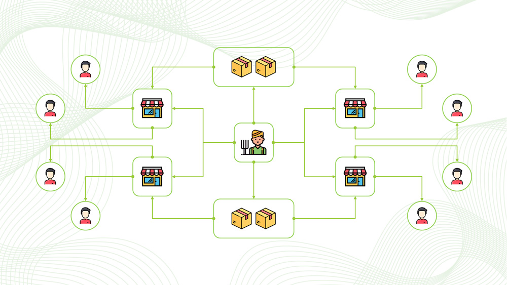
We aims to build an ecosystem that provides farmers the freedom to sell their produce, multiple trading options, remunerative prices, and an efficient and barrier-free agricultural market. We want to fulfil these objectives in two ways: First, by enabling the farmers to sell their produce directly to any traders and retailers. Second, by facilitating the setting up of digital agricultural trading platforms for all three (i.e. F2B2B2C).
Wireframes (Mid Fedility)
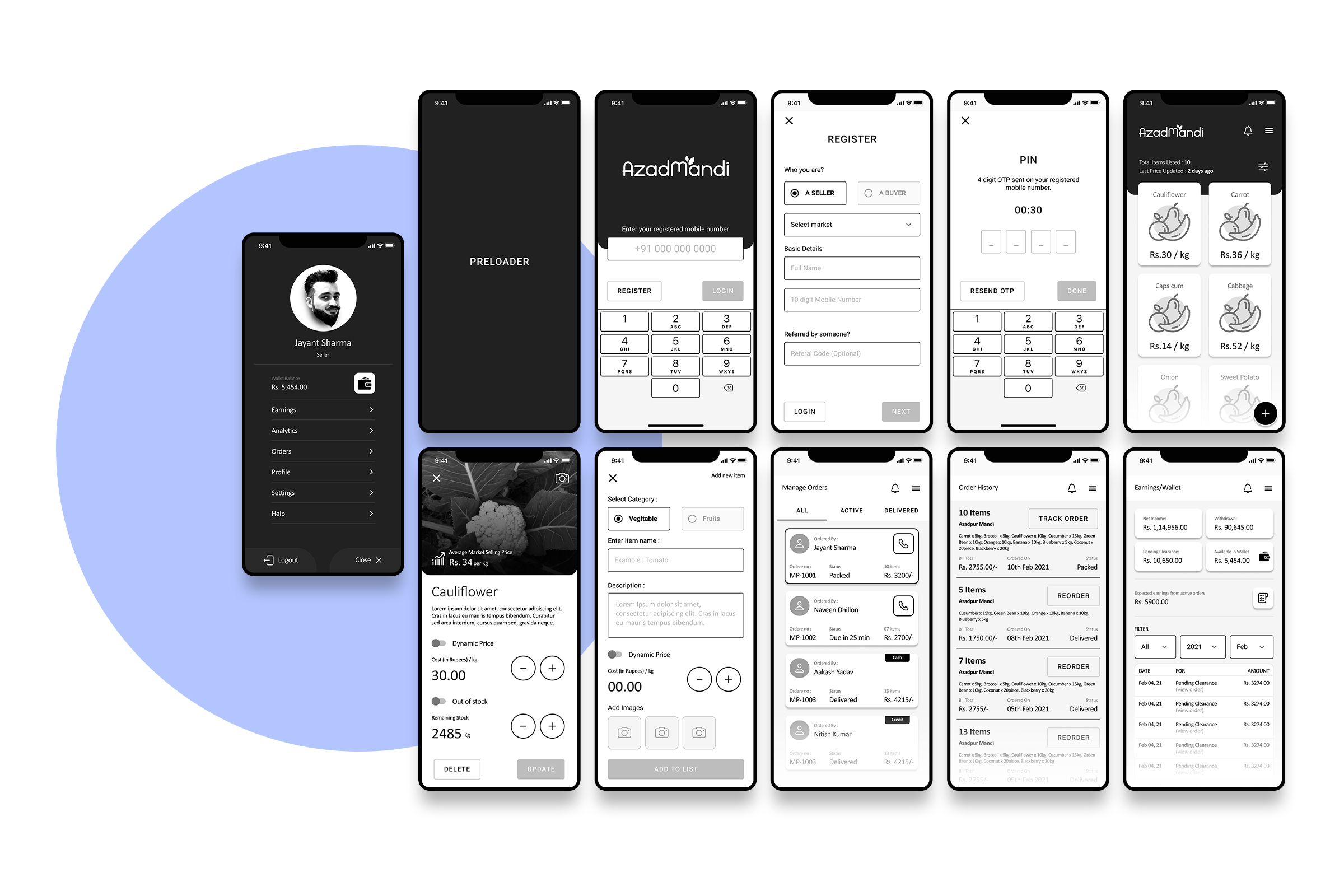
I created working prototype of app in figma and went to the end users (farmers and Buyers) & collected the feedback, based on that i did multiple iterations to reach to the final flow of the app. Then i started creating UI Design for the app.
UI Design
Login/Signup Flow
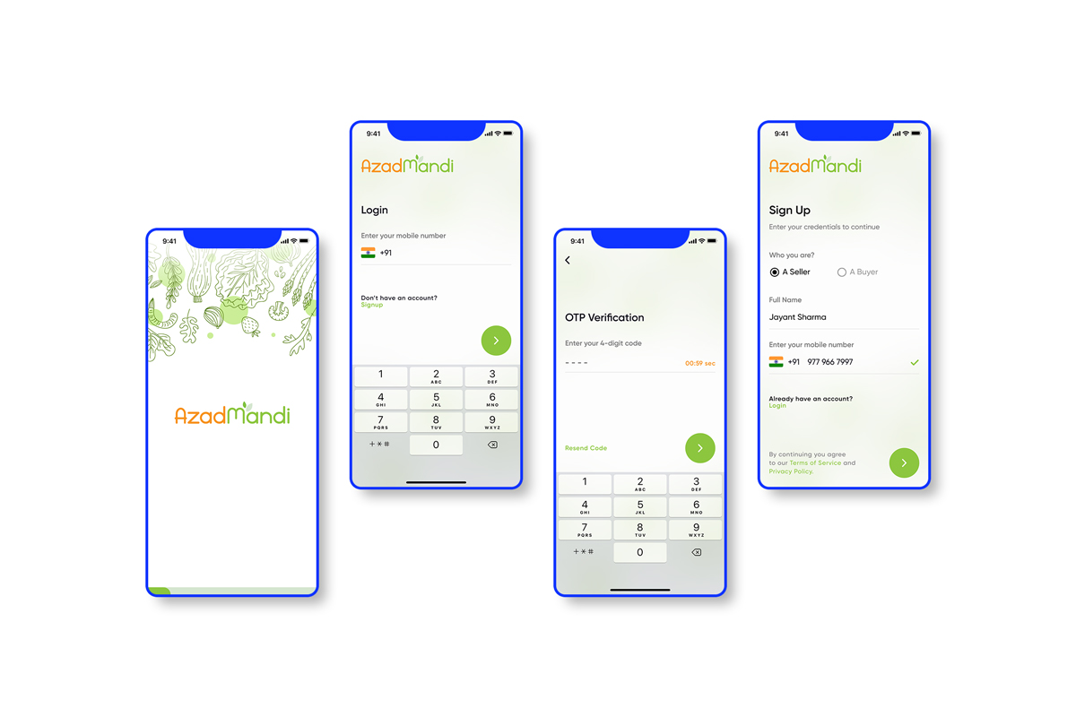
We want to make this as simple as it is. Just login with mobile number and OTP verification.
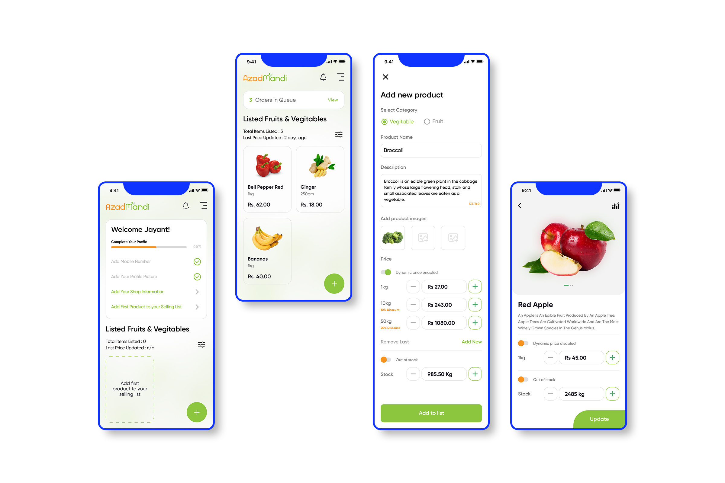
Seamless Onboarding for new Sellers (Farmers)
After new user logs in, they go through onboarding steps to fill their information about shop, items details, pricing and stock.
Order Packaging and Tracking
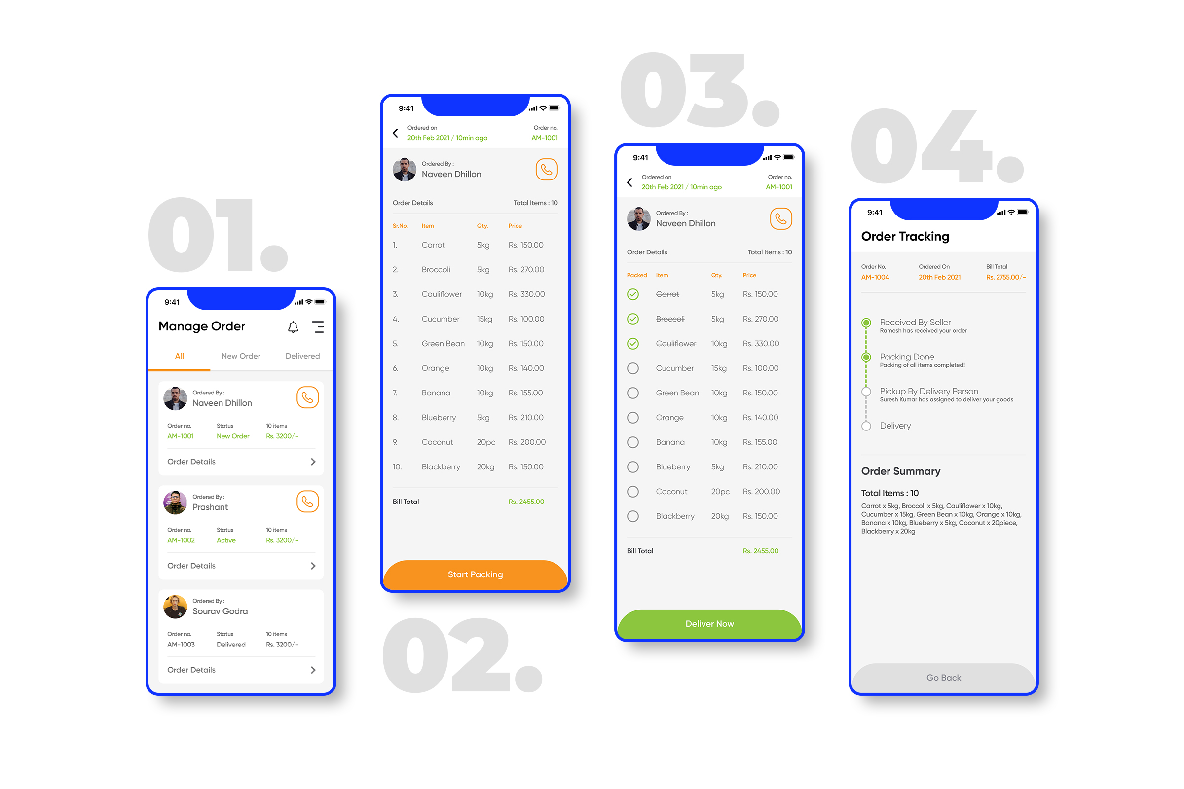
Sellers will have option to check out the list of requested items by the buyers (Screen 01 & 02) and they will start packing it(Screen 02 & 03) and because these orders will not be small quantity orders so we want to keep track of each and every items whether it is packed or not. On buyer side we need to provide order tracking (Screen 04).
Profile Section of Farmer
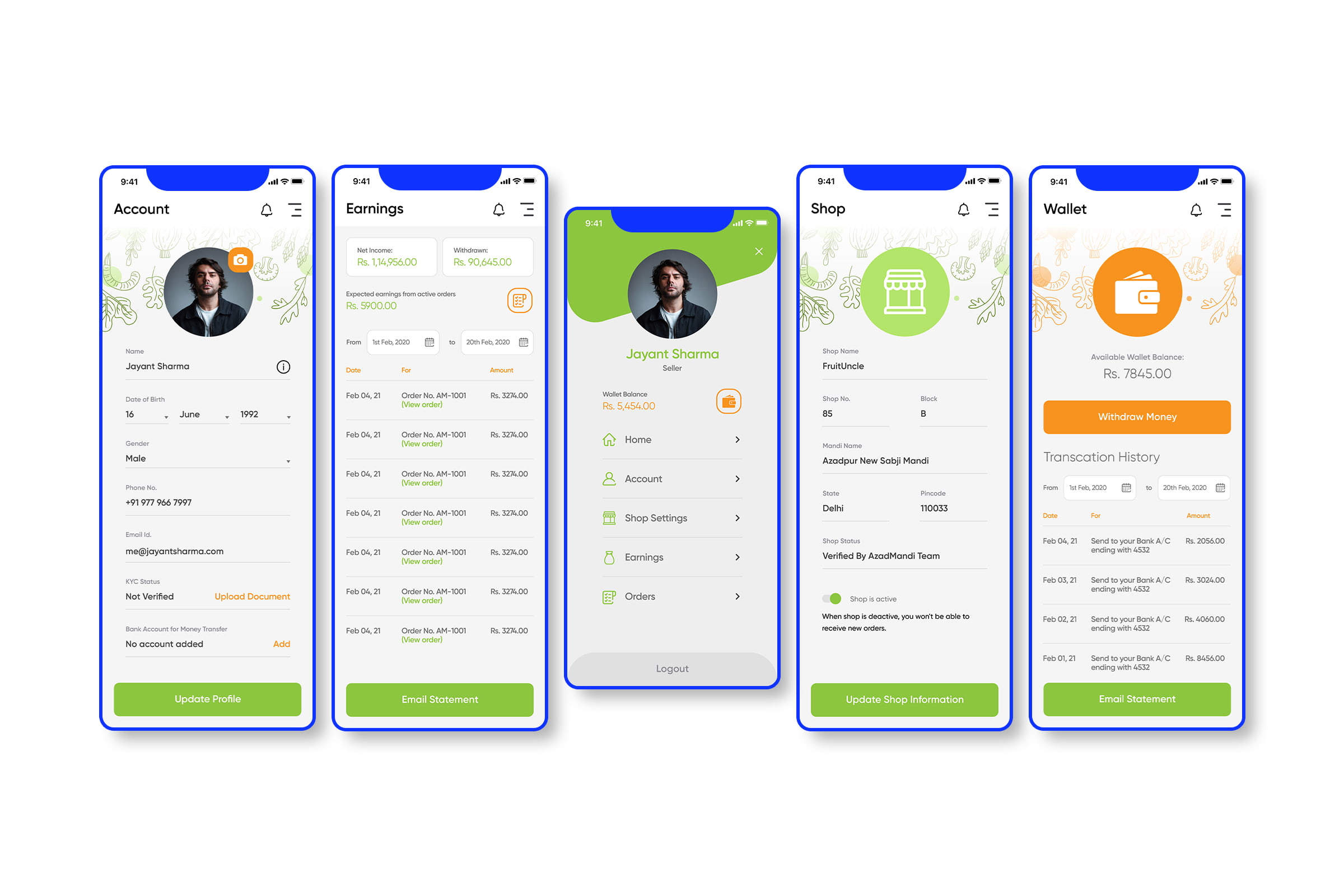
A profile section with options to edit account details,KYC info, Bank Details, Check Earnings, Edit Open/Close Shop information and Wallet.